

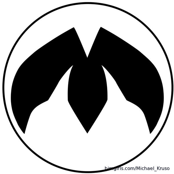
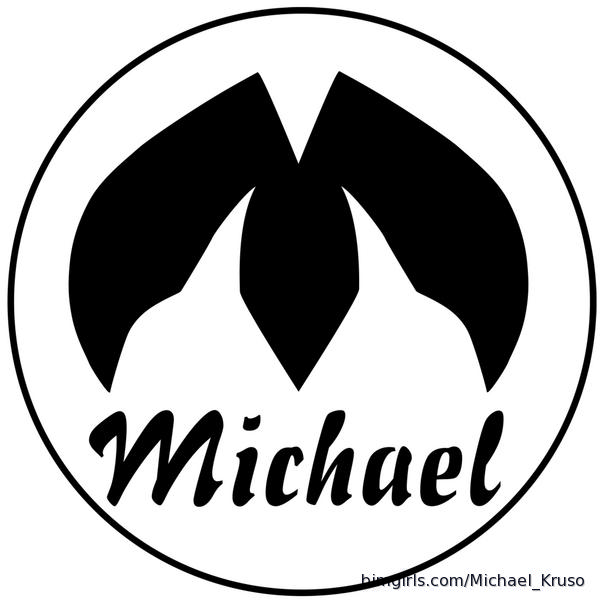
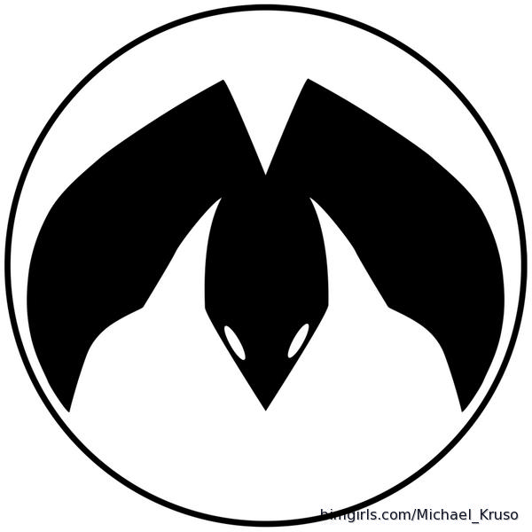
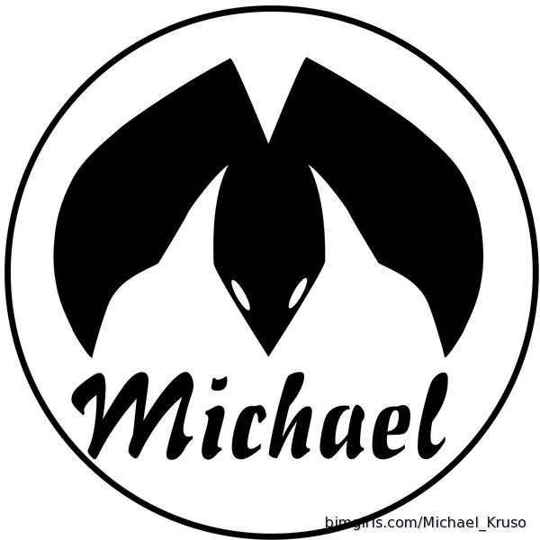
So...apologies in advance, this might be long. Besides the balancing of day job/s and health, I've been struggling with I guess you can say what my identity is when it comes to the artwork I create. What I currently have now I feel represents what my college teachers told me would work and shows my skills in both graphic and traditional art. I'm a decent graphic artist, even though I graduated with a degree in that field, but the amount of time it takes me to even create a decent looking piece takes me way too long. Even then, it will look like crap. For the many here that have seen my traditional work can see what I love to do. Fanciful pieces with beautiful women, dragons or other mythical creatures, and nature. These logos here are what I have been sketching out. Using the foot of a therapod dinosaur and converting it into my initial and having it complete black. The first is just the print, the next has my name below it. The latter two, I put eyes on the middle toe to make it be a silhouette of a "dragon" flying down. I think if I can make the middle toe with the eyes more rounded like a head it might look better, but the sharpness would be lost. For the change, I felt making the M like this is to show the fanciful elements of my work, predominantly of the dragons, Godzilla, and giant monsters. The roundness could represent the curves of a woman, but that can be a stretch. I could also make the outer claws straight and see how that works. Either could work, word being could. The eyes could be much and the simple black with my name is probably enough, but I'm posting the ideas here for feedback. Once I feel a have something substantial, I'll go back and redo these. Any advice and critique is always welcomed.